Explore the charm of retro color schemes with a blend of muted pastels and deep jewel tones, reminiscent of classic elegance.
Disclosure: This post contains affiliate links. We may earn a commission at no extra cost to you.
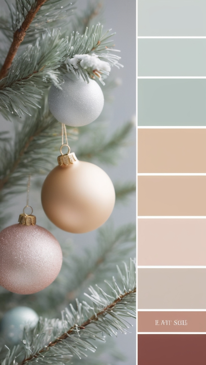
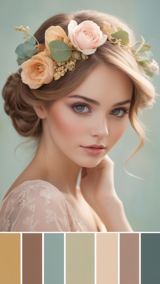
Vintage color palettes feature a range of muted pastels and earthy tones, including blush pink, sage green, mustard yellow, and ruby red. These colors evoke a sense of nostalgia and charm in home decor. When incorporating vintage colors, consider mixing warm and cool tones for a balanced look. Benefits include creating a cozy and inviting atmosphere. To incorporate vintage colors effectively, start by selecting a primary color and then adding complementary shades for depth. Experiment with different color combinations to find what suits your style best.
Vintage color palettes have gained popularity in recent years, with many homeowners opting for a nostalgic and charming aesthetic in their interior design. These color schemes typically include a mix of muted pastels, earthy tones, and deep jewel tones that evoke a sense of history and timelessness. As a homeowner who appreciates the beauty of vintage colors, I have found that incorporating these hues into my home decor can add a unique and timeless touch to any space.
1. What defines a vintage color palette?
Vintage color palettes are characterized by a mix of colors that were popular in past eras, particularly the mid-20th century. These palettes often include muted pastels such as blush pink, sage green, and lavender, which were commonly used in interior design during the 1950s and 1960s. Earthy tones like mustard yellow, burnt orange, and olive green also feature prominently in vintage color schemes, adding warmth and depth to the overall aesthetic. Deep jewel tones like ruby red, sapphire blue, and emerald green are another key component of vintage color palettes, lending a sense of luxury and sophistication to the space.
2. Why are muted pastels like blush pink and sage green popular in vintage color schemes?
Muted pastels like blush pink and sage green are popular in vintage color schemes because they evoke a sense of softness and femininity. These colors were commonly used in mid-century interior design to create a calm and soothing atmosphere, making them ideal for bedrooms, living rooms, and other relaxation spaces. Blush pink adds a touch of elegance and romance to a room, while sage green brings a sense of nature and tranquility. When used together, these muted pastels can create a harmonious and inviting environment.
3. How do earthy tones such as mustard yellow and olive green contribute to the vintage aesthetic?
Earthy tones like mustard yellow and olive green contribute to the vintage aesthetic by adding warmth and richness to the color palette. Mustard yellow, in particular, is a bold and vibrant hue that can create a focal point in a room, while olive green brings a sense of nature and earthiness. These earthy tones are often used in accent pieces such as throw pillows, rugs, and artwork to add depth and texture to the space. When paired with muted pastels and deep jewel tones, earthy tones can create a balanced and cohesive vintage look.
4. What is the significance of deep jewel tones like ruby red and sapphire blue in vintage color palettes?
Deep jewel tones like ruby red and sapphire blue play a crucial role in vintage color palettes by adding drama and sophistication to the overall design. These rich and luxurious colors were popular in mid-century interior design, particularly in furnishings and decor accessories. Ruby red conveys a sense of passion and energy, while sapphire blue evokes a feeling of calm and serenity. When used strategically in a room, deep jewel tones can create a sense of opulence and glamour, elevating the space to a new level of elegance.
5. How do warm and cool tones work together to create nostalgia and charm in vintage color schemes?
Warm and cool tones work together in vintage color schemes to create a sense of balance and harmony. By combining colors from both ends of the spectrum, homeowners can evoke a feeling of nostalgia and charm that is characteristic of vintage design. Warm tones like mustard yellow and ruby red add vibrancy and energy to the space, while cool tones like sage green and sapphire blue bring a sense of calm and tranquility. When used in conjunction, warm and cool tones can create a dynamic and visually appealing color palette that captures the essence of vintage style.
6. What are some key characteristics of vintage color palettes that set them apart from modern color trends?
Vintage color palettes have several key characteristics that set them apart from modern color trends. One of the main differences is the use of muted and understated hues, such as blush pink and olive green, which create a soft and timeless look. Vintage color schemes also often feature a mix of warm and cool tones, as well as deep jewel tones, adding depth and richness to the overall design. In contrast, modern color trends tend to favor bold and saturated colors, as well as minimalist and monochromatic palettes. By incorporating vintage colors into contemporary design, homeowners can achieve a unique and eclectic look that blends the best of both worlds.
7. How can incorporating vintage colors into contemporary design add a unique and timeless touch to a space?
Incorporating vintage colors into contemporary design can add a unique and timeless touch to a space by infusing it with character and nostalgia. By mixing muted pastels, earthy tones, and deep jewel tones, homeowners can create a color palette that is rich, diverse, and visually engaging. Vintage colors can be used in a variety of ways, from wall paint and upholstery to accessories and decor accents, allowing homeowners to personalize their space and create a sense of warmth and comfort. Whether used sparingly as accents or boldly as focal points, vintage colors can transform a room and evoke a sense of history and tradition that is both charming and enduring.
As a homeowner who values the beauty and nostalgia of vintage colors, I have found that incorporating these hues into my home decor has brought a sense of warmth and personality to each room. By mixing muted pastels with earthy tones and deep jewel tones, I have created a color palette that is both inviting and sophisticated. Whether through wall paint, furniture, or accessories, vintage colors have added a unique and timeless touch to my space, making it a place that feels both familiar and special. By understanding the significance of vintage color palettes and how they can enhance contemporary design, homeowners can create a space that is truly their own, reflecting their personal style and aesthetic preferences.
Exploring Vintage Color Palettes: 12 Unique Ideas for Your Home Decor
When it comes to home decor, vintage color palettes offer a unique charm and nostalgia that can transform any space. Inspired by a range of muted pastels and earthy tones, including blush pink, sage green, mustard yellow, and ruby red, vintage colors can create a cozy and inviting atmosphere in your home. If you’re looking to incorporate vintage colors into your decor, here are 12 unique ideas to get you started.
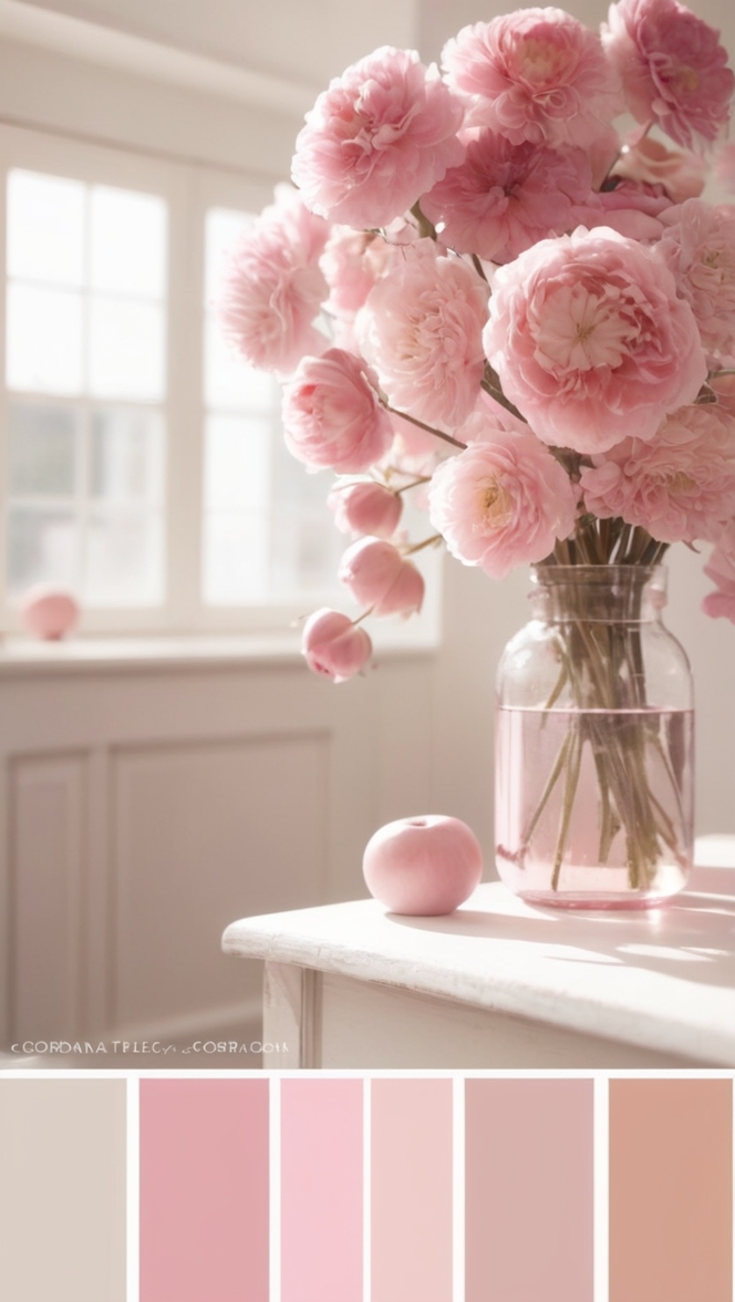
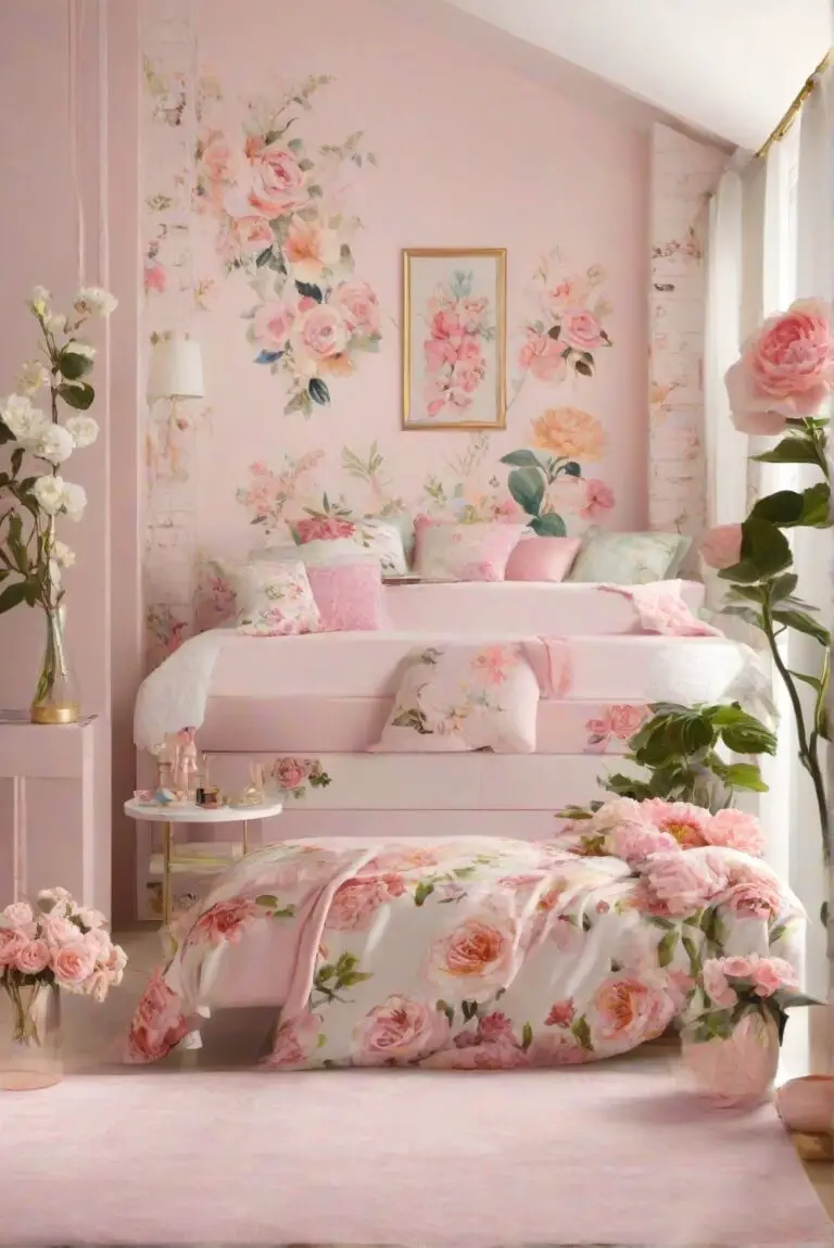
1. Blush Pink Elegance
Blush pink is a timeless vintage color that exudes elegance and sophistication. Pair this soft hue with creamy whites and gold accents for a romantic and luxurious look in your living room or bedroom.
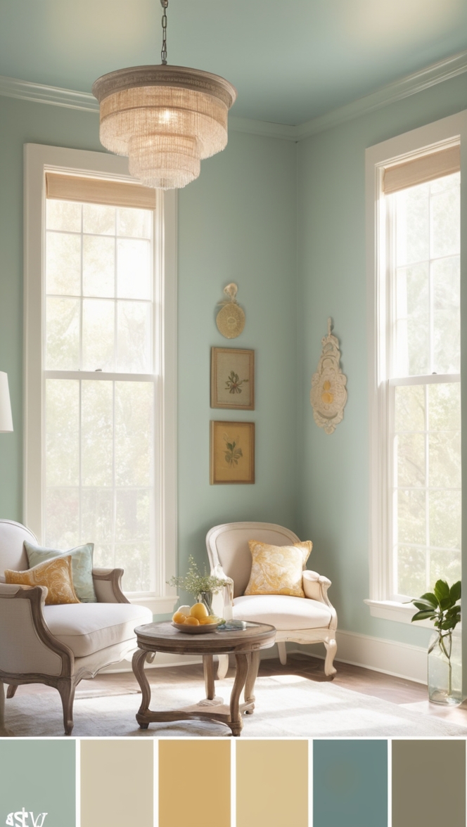
2. Sage Green Serenity
Sage green is a calming and soothing vintage color that can bring a sense of serenity to any space. Combine sage green with natural wood tones and botanical prints for a relaxed and earthy vibe in your kitchen or dining area.
3. Mustard Yellow Sunshine
Mustard yellow is a cheerful vintage color that adds a pop of sunshine to your home decor. Pair this vibrant hue with navy blue and warm neutrals for a bold and eclectic look in your home office or study.
4. Ruby Red Romance
Ruby red is a rich and passionate vintage color that can create a sense of romance and drama in your decor. Mix ruby red with soft pinks and metallic accents for a glamorous and sophisticated look in your dining room or entryway.
5. Mixing Warm and Cool Tones
When incorporating vintage colors into your decor, don’t be afraid to mix warm and cool tones for a balanced and harmonious look. Experiment with pairing soft pastels with deep jewel tones for a dynamic and layered effect in your living space.
6. Creating Depth with Complementary Shades
To add depth and dimension to your vintage color palette, consider adding complementary shades to your primary color. For example, pair a soft blush pink with a dusty rose or a muted sage green with a deep forest green for a sophisticated and cohesive look in your home.
7. Finding Your Style
When experimenting with vintage colors, it’s important to find what suits your personal style and aesthetic preferences. Whether you prefer a more traditional and classic look or a modern and eclectic vibe, vintage colors can be tailored to fit your unique taste and personality.
8. Embracing Retro Vibes
Embrace the retro vibes of vintage color palettes by incorporating mid-century modern furniture and decor elements into your space. Pair bold vintage colors with geometric patterns and sleek lines for a playful and nostalgic look in your home.
9. Adding Texture and Layers
Enhance the richness and depth of your vintage color palette by adding texture and layers to your decor. Mix different fabrics like velvet, linen, and wool for a tactile and cozy feel in your living room or bedroom.
10. Playing with Patterns
Experiment with mixing patterns and prints to create visual interest and dimension in your vintage color palette. Combine floral motifs with geometric shapes or stripes with polka dots for a fun and eclectic look in your home.
11. Incorporating Vintage Accessories
Enhance the vintage charm of your color palette by incorporating retro accessories and decor pieces into your space. Display vintage artwork, ceramics, and collectibles to add character and personality to your home.
12. Personalizing Your Space
Make your vintage color palette truly your own by personalizing your space with meaningful objects and mementos. Whether it’s family heirlooms, travel souvenirs, or handmade crafts, infuse your decor with items that tell your unique story and reflect your individuality.
In conclusion, vintage color palettes offer a wide range of possibilities for creating a cozy, inviting, and stylish home decor. By exploring unique ideas and experimenting with different color combinations, you can transform your space into a nostalgic and charming retreat that reflects your personal style and aesthetic preferences. So go ahead and embrace the beauty of vintage colors in your home!