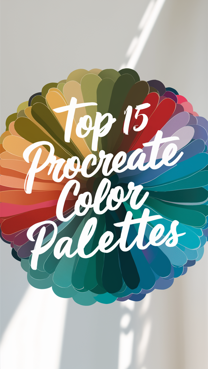
Explore the Procreate color palette for stunning digital art, mastering color theory, schemes, and palette generator tips.
Disclosure: This post contains affiliate links. We may earn a commission at no extra cost to you.
What are the best tips for using the Procreate color palette?
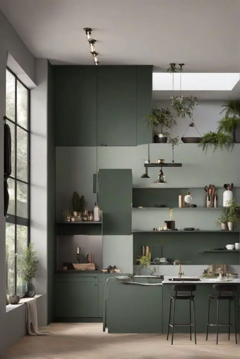
Procreate color palette offers a wide array of colors to choose from, allowing you to create stunning digital artwork. To make the most of it, start by organizing your favorite colors into palettes for easy access. Experiment with different color combinations to find what works best for your projects. Utilize the color harmony tool to ensure your colors complement each other. Be sure to save your favorite color palettes for future use. Keep in mind that contrasting colors can create visual interest, while harmonious colors can evoke a certain mood or feeling in your artwork.
## What are the best tips for using the Procreate color palette?
Procreate is a popular digital art app that offers a wide range of tools and features to help artists create stunning illustrations and designs. One of the key elements of Procreate is its color palette, which allows users to select and organize colors for their artwork. In this article, we will explore some of the best tips for using the Procreate color palette to enhance your digital art projects.
### 1. Creating a custom color palette in Procreate
One of the first things you may want to do when using Procreate is to create a custom color palette that suits your style and preferences. To create a custom color palette in Procreate, simply open the color palette panel and tap on the “+” icon to add a new color swatch. You can then use the color wheel and sliders to adjust the hue, saturation, and brightness of the color until you find the perfect shade. Repeat this process to add more colors to your custom palette.
### 2. Organizing colors in the Procreate palette
Organizing colors in the Procreate palette is essential for easy access and efficient workflow. You can group similar colors together by creating color sets or folders within the palette. Simply drag and drop colors into different folders to organize them based on themes, projects, or color schemes. This will help you quickly locate and select the colors you need while working on your artwork.
### 3. Using shortcuts for selecting colors quickly
Procreate offers several shortcuts for selecting colors quickly and efficiently. You can use the eyedropper tool to sample colors from your canvas or reference images by tapping and holding on the screen. Additionally, you can press and hold on a color swatch in the palette to activate the color picker tool, which allows you to select colors directly from your canvas. These shortcuts can save you time and make the color selection process more seamless.
### 4. Using the color harmony feature in Procreate
The color harmony feature in Procreate is a powerful tool that helps you create cohesive color schemes for your artwork. You can access the color harmony panel by tapping on the harmony icon in the color palette. From there, you can choose from various color harmony rules such as complementary, analogous, triadic, and more. Experimenting with different harmony rules can help you create visually appealing color combinations that enhance the overall look of your artwork.
### 5. Advanced techniques for blending colors in Procreate
Blending colors in Procreate is essential for creating smooth transitions and gradients in your artwork. To blend colors, you can use the smudge tool with a soft brush to gently mix two or more colors together on your canvas. Adjusting the opacity and flow of the smudge tool can help you control the intensity of the blending effect. Experiment with different brush settings and blending techniques to achieve the desired result in your artwork.
### 6. Importing color palettes into Procreate
If you have color palettes saved from other sources or reference images, you can easily import them into Procreate for use in your artwork. To import a color palette, simply open the color palette panel, tap on the “Palettes” tab, and select the import option. You can then choose the color palette file from your device and import it into Procreate. Imported color palettes can be used alongside your custom palettes to expand your color options and creativity.
### 7. Making the most of the color picker tool in Procreate
The color picker tool in Procreate is a versatile tool that allows you to select colors with precision and accuracy. You can access the color picker tool by tapping and holding on the screen with your finger or Apple Pencil. This tool displays the color values of the pixel you are touching, allowing you to pick colors from your canvas or reference images with ease. You can also use the sliders to adjust the hue, saturation, and brightness of the selected color for fine-tuning.
By incorporating these tips and techniques into your workflow, you can maximize the potential of the Procreate color palette and elevate your digital art projects to new heights. Experiment with different color combinations, blending techniques, and color harmony rules to create vibrant and visually striking artwork that showcases your creativity and skills. With practice and exploration, you can unlock the full potential of the Procreate color palette and create artwork that truly stands out.
12 Unique Ideas for Using the Procreate Color Palette
1. Ocean Breeze
Experiment with shades of blue, teal, and white to create a calming ocean-inspired color palette. Use these colors to bring a sense of serenity and tranquility to your digital artwork.
2. Sunset Glow
Blend warm hues like orange, pink, and purple to capture the vibrant colors of a beautiful sunset. This palette can add a touch of warmth and energy to your designs.
3. Forest Whispers
Explore shades of green, brown, and earth tones to create a natural and organic color palette. These colors can bring a sense of grounding and connection to nature in your artwork.
4. Midnight Magic
Combine deep blues, purples, and blacks to create a mysterious and enchanting color palette. Use these colors to add depth and drama to your digital creations.
5. Cherry Blossom
Play with soft pinks, whites, and light greens to evoke the delicate beauty of cherry blossoms. This palette can bring a sense of elegance and femininity to your artwork.
6. Citrus Burst
Mix bright yellows, oranges, and greens to create a lively and energetic color palette. Use these colors to add a pop of freshness and vibrancy to your designs.
7. Desert Sands
Explore warm tones like beige, tan, and dusty browns to create a desert-inspired color palette. These colors can evoke a sense of warmth and arid beauty in your digital artwork.
8. Northern Lights
Blend iridescent blues, greens, and purples to capture the magical hues of the northern lights. This palette can add a sense of wonder and mystique to your designs.
9. Tropical Paradise
Combine bold tropical colors like turquoise, fuchsia, and lime green to create a vibrant and exotic color palette. Use these colors to infuse your artwork with a sense of tropical fun and energy.
10. Autumn Leaves
Explore rich reds, oranges, and yellows to mimic the colors of falling autumn leaves. This palette can bring a sense of coziness and nostalgia to your digital creations.
11. Winter Wonderland
Play with icy blues, silvers, and whites to create a frosty winter-inspired color palette. These colors can add a sense of cold beauty and tranquility to your artwork.
12. Pastel Dreams
Experiment with soft pastel hues like lavender, mint, and peach to create a dreamy and ethereal color palette. Use these colors to add a sense of whimsy and fantasy to your designs.