Explore how integrating wall colors with your artwork can elevate your living room’s aesthetic. Follow our daily routine for a cohesive and stylish design.
**How to create a cohesive look with wall colors that match your artwork in the living room?**
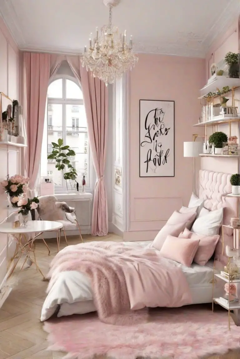
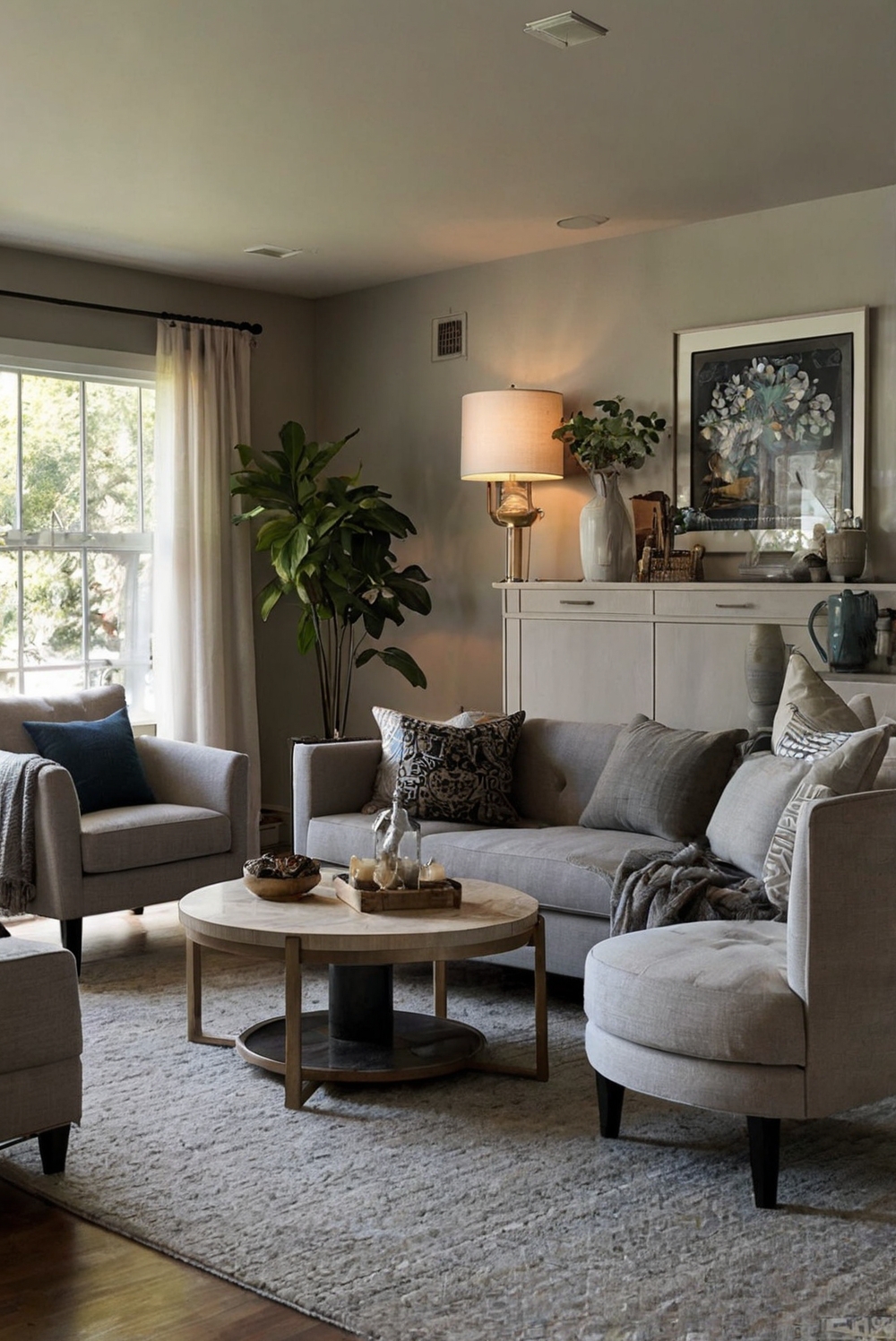
To create a cohesive look in your living room with wall colors that match your artwork, start by choosing a dominant color from your artwork and use it as the main wall color. Consider using a neutral color as a backdrop to showcase the artwork. Balance bold art pieces with subtle wall colors or vice versa for a harmonious look. If unsure, opt for a versatile color palette that complements different artworks. Test paint samples on the wall before committing to a color. Ensure proper lighting to enhance both the art and wall colors. Incorporating textures and patterns can add depth to the space. Stay organized by creating a mood board to visualize the final look.
When it comes to home decorating and interior design, thoughtful space planning is essential for a cohesive and aesthetically pleasing outcome. It is recommended to work with interior designers for expert advice on creating a balanced and stylish living room. Utilizing designer wall paint and primers specifically formulated for walls can ensure a lasting finish. Pay attention to color matching when selecting paint colors to achieve the desired cohesion. Experiment with different shades and finishes to find the perfect match for your artwork. Remember that a well-coordinated color scheme can elevate the overall ambience of your living room.
In summary, by focusing on color coordination and design elements, you can create an inviting living room that beautifully showcases your artwork while maintaining a harmonious balance in the space.
How to choose wall colors that complement the colors in my artwork for a cohesive look in the living room?
Choosing wall colors that complement the colors in your artwork is essential for creating a cohesive look in your living room. To achieve this, you can follow these tips:
– **Consider the Color Wheel:** Look at the colors in your artwork and find their complementary colors on the color wheel. Choosing a wall color that is opposite to the dominant color in your artwork can create a harmonious balance.
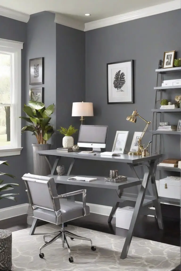
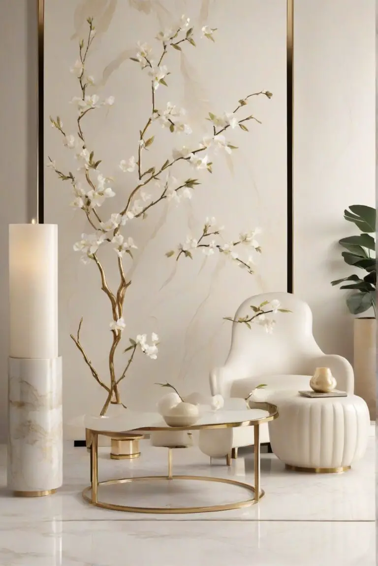
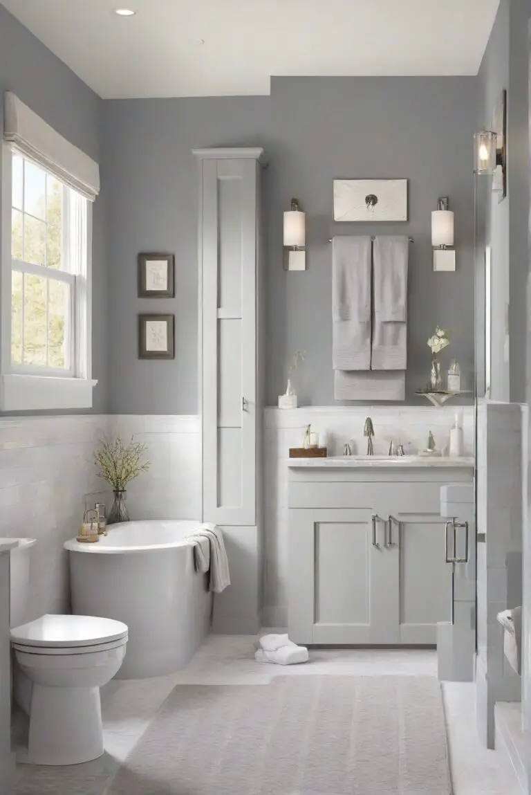
– **Neutral Background:** Opt for neutral wall colors like white, beige, or grey to allow your artwork to pop. Neutral colors provide a subtle backdrop that doesn’t compete with the colors in your artwork.
– **Match the Undertones:** Pay attention to the undertones of both the artwork and the wall color. If your artwork has warm undertones, choose a wall color with similar warm undertones to create a cohesive look.
– **Sample Testing:** Always test the wall colors by painting small sections and observing how they interact with your artwork in different lighting conditions.
– **Consider the Mood:** Think about the mood you want to create in the room. Soft pastel wall colors can enhance a serene and calming atmosphere, while bold wall colors can add drama and energy.
– **Balance of Colors:** Ensure there is a balance between the colors in your artwork and the wall colors. Avoid overwhelming the space with too many vibrant colors.
– **Consult a Professional:** If you’re unsure about color choices, consider consulting a professional interior designer for expert advice.
Can I mix different types of artwork styles and still create a cohesive look with matching wall colors in the living room?
Mixing different types of artwork styles can add interest and personality to your living room. To create a cohesive look with matching wall colors, consider the following ideas:
– **Common Color Palette:** Choose artwork pieces that share a common color palette. This will help tie together different styles and create a cohesive look.
– **Consistent Frames:** Use similar frames or matting for all the artwork to create a unified appearance, even if the styles are diverse.
– **Theme or Subject:** Select artwork with a common theme or subject matter to create a sense of cohesion. For example, nature-inspired artwork can work well together regardless of style.
– **Gallery Wall:** Create a gallery wall with a mix of artwork styles but unified by a consistent wall color. This approach can showcase your diverse collection while maintaining a cohesive look.
– **Layering and Grouping:** Experiment with layering different artwork pieces or grouping them together to create visual interest. Use matching wall colors to tie everything together.
– **Statement Piece:** Anchor the room with a statement artwork piece that sets the tone for the space. Choose wall colors that complement this focal point.
– **Texture and Dimension:** Mix artwork styles that vary in texture and dimension to add depth to the room. Ensure the wall colors enhance these elements.
What is the importance of lighting when it comes to showcasing artwork and wall colors in the living room?
Lighting plays a crucial role in showcasing artwork and wall colors in the living room. Here are some reasons why lighting is important and how you can utilize it effectively:
– **Highlighting Artwork:** Proper lighting can enhance the colors and details of your artwork, making it the focal point of the room. Consider track lighting or picture lights to illuminate specific pieces.
– **Color Accuracy:** Good lighting ensures that the wall colors appear true to their actual shade. Natural light can bring out the richness of paint colors and artwork hues.
– **Creating Ambiance:** Lighting sets the mood in the living room. Dimmable lights can create a cozy atmosphere, while bright lights are ideal for showcasing artwork during the day.
– **Layered Lighting:** Combine different types of lighting, such as overhead lights, floor lamps, and wall sconces, to create a layered effect that highlights both the artwork and wall colors.
– **Adjustable Fixtures:** Opt for fixtures with adjustable settings to control the direction and intensity of light. This allows you to focus the light on artwork or change the ambiance as needed.
– **Natural Light:** Maximize natural light by keeping windows unobstructed and using sheer curtains. Natural light can bring out the vibrancy of colors in both artwork and wall paint.
– **Artificial Lighting:** Choose warm or cool-toned bulbs depending on the desired ambiance. Warm light can enhance earthy tones, while cool light can complement blues and greens.
How to create a cohesive look with wall colors that match your artwork in the living room?
To create a cohesive look with wall colors that match your artwork in the living room, consider the following trend ideas:
– **Monochromatic Palette:** Opt for a monochromatic color scheme where the wall color is a shade of the dominant color in your artwork. This creates a seamless flow and highlights the artwork.
– **Color Blocking:** Experiment with color blocking by painting one wall in a bold color that complements the artwork. This technique can create a striking focal point in the room.
– **Ombre Effect:** Create an ombre effect on the walls by blending different shades of a color. This subtle transition can complement the varying colors in your artwork.
– **Contrasting Accents:** Use contrasting accent walls to make the artwork stand out. For example, if your artwork features warm tones, a cool-toned accent wall can provide a striking backdrop.
– **Metallic Finishes:** Consider metallic wall finishes like gold or silver to add a touch of luxury and sophistication. These finishes can complement a wide range of artwork styles.
– **Nature-Inspired Hues:** Choose wall colors inspired by nature, such as earthy greens, serene blues, or warm browns. These colors can harmonize with natural elements in your artwork.
– **Vintage Vibes:** Embrace vintage wall colors like muted pastels or faded neutrals to create a nostalgic and charming ambiance. These colors can complement vintage artwork pieces.
– **Geometric Patterns:** Incorporate geometric wall patterns in coordinating colors with your artwork. This modern approach adds visual interest and ties the room together.
– **Artistic Murals:** Consider commissioning an artistic mural that incorporates the colors of your artwork. This personalized touch can create a unique and cohesive look in the living room.